"Exiled from Truth and Iconography"
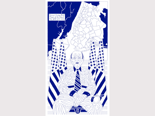
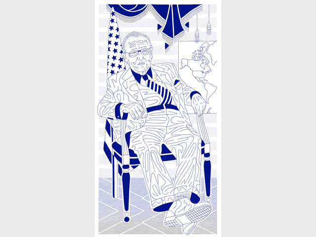
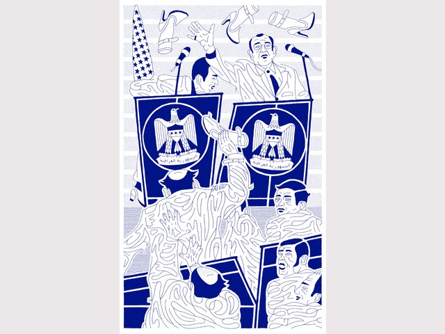
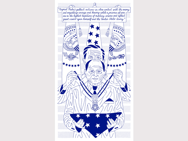
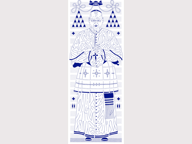

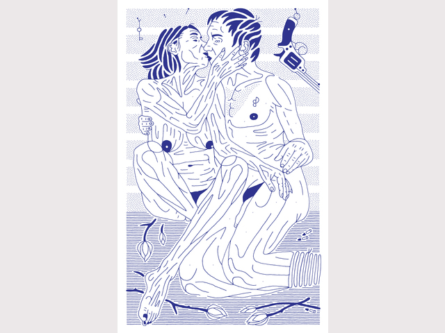

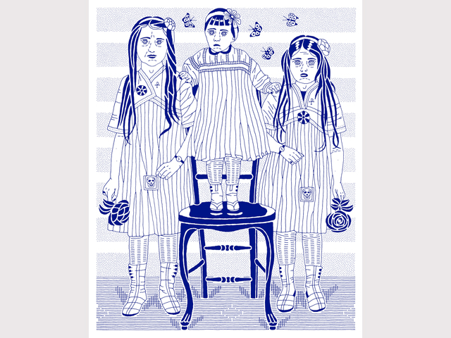
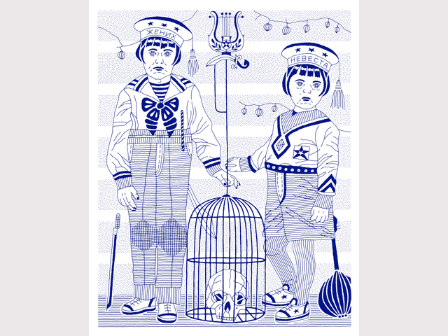
The first presentation, curated by Dr. Regina Khidekel, is "Exiled from Truth and Iconography", which includes drawings by RACC artist Dmitry Borshch and an excerpt from his interview with philosopher Patrick Maynard. The drawings belong to two related series, first of which the artist describes thus, "'Exiled from Truth: Nine Allegories by Dmitry Borshch' is the title under which some allegorical pictures are collected, possibly more than nine: the series continues to develop. They are united by color, style, and technique, so I view them as a homogeneous collection of drawings. Allegory, drawn or written, is a product of that mind which regards truth as existing-in-absence: it does exist yet is absent from our view. Allegories like mine would not be needed if truth were openly present." The second series is called "Iconography". Inspired by prints after Anthony van Dyck’s drawings which collectively bear the same name, it includes portraits of living artists, writers, politicians, distinguished soldiers. Together these series reveal one artist's journey from allegory to engagement with contemporary, and often political, matters.
Dmitry Borshch was born in Dnepropetrovsk, studied in Moscow, today lives in New York. His drawings and sculptures have been exhibited at the National Arts Club (New York), Brecht Forum (New York), Exit Art (New York), CUNY Graduate Center (New York), Salmagundi Club (New York), ISE Cultural Foundation (New York), Williamsburg Art and Historical Center (New York), Parish Art Museum (Southampton), International Human Rights Law Institute of DePaul University (Chicago), Frieze Art Fair (London).
Patrick Maynard describes his work thus: "Most of my publications and talks concern the nature, function, and perception of pictorial representations and similar expressive forms. They are theoretical, but argued from 'real world' engagement with things that matter to people, from the prehistoric to our own times. These discussions not only feature a broad variety of illustrations, but, as 'substantive' philosophy, are typically based on them. They are of interest not only to philosophers but also to artists, art critics and historians." Dr. Maynard is the author of Drawing Distinctions (Cornell University Press, 2005), The Engine of Visualization (Cornell University Press, 1997), and other works.
Here is an excerpt from his conversation with Dmitry Borshch:
A preliminary question is whether you do different kinds of drawing. A related question is: noting your expressed enjoyment of first marks on surfaces, are they of the same general sort as the works we see – are they in ink? You also have mentioned the enjoyment of completion, even if not of finishing since – as you, like others, insist – works are rarely finished. They are available online as ink drawings, yet you note that some are cyanotype prints from transparent reversals of the ink work, via computer. Was that only about one group of them?
Yes. When a drawing looks relatively finished, I pass it through those media, graphic and not, that I have technical proficiency in – etching, lithography, and some others like cyanotype. In these fresh contexts my images reveal themselves freshly – to me and, I am hoping, you. Context changes an image of every type, often changing colorful paintings (even grisailles) more than line drawings because lines are perceived less subjectively than colors.
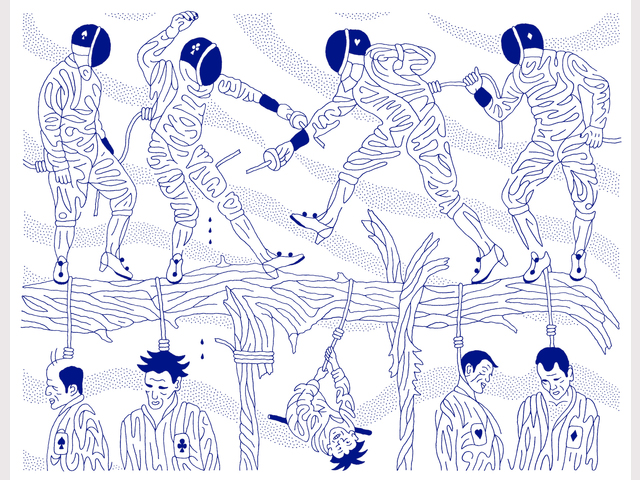
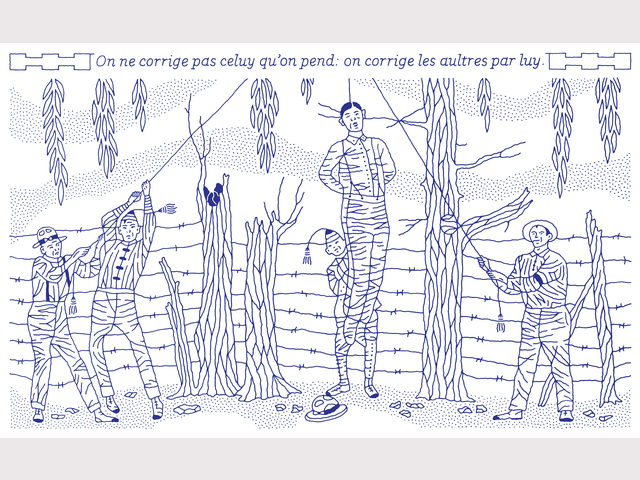
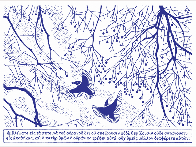
When we hear about "space" in pictures, the topic is mostly depth – that is, 3D or 2D representation of 3D which we will get to later. But there are other dimensions of interest, as celebrated (am I the first to notice this?) in a child’s game (has it a Russian name?) in English called "paper, scissors, stone" whereby the 2, 1 and 3D aspects of objects are invoked: as powers. Your drawing makes remarkably evident this more general issue of dimensionality. Following John Willats, we may say that an immediately apparent aspect of your work is that its marks fall into distinct classes: dots (virtually 0-dimensional marks), lines (1D) and 2D regions. Also within, even across pictures, they are uniform: dots of the same size, lines of the same width or only a couple of grouped widths – all monochrome. You also combine these elements to invoke each other's dimensions. Stippled, your dots usually gather to form regions – notably rectangles that close depicted spaces at the back. Dots also describe lines while lines circumscribe, or group to form, regions but also cross to form point locations ("fashy" and "Думаешь иногда"). If we now consider what these units or groups may depict, we note that (as is usual) your lines may denote cracks ("Wallstones Breaking"), edges and lines ("Betrothal of the Virgins"), contours ("Waterboarding of Abu Zubaydah"), things ("Wildbirds Among Branches"), or group to depict regions ("Will it contain you, this house I have built?"). Depiction gets us into the big topic of subject matter (iconography and iconology) and also 3D but before going there we might touch on material facture again, notably color.
Although the online work is monochrome, it reserves the white ground which asserts its own shapes. The blue of cyanotypes is ferric ferrocyanide, "Prussian blue" (now represented by phthalocyanine blue), known from blueprints but also graphics like Hokusai’s "Under the Wave off Kanagawa". Your blue ink seems similar: is that so?
Yes. I start by choosing paper: white smooth kind is my choice now. Dark blue harmonizes with it better than other colors. I tried many of them, including lighter blues.
This "iron blue" is assertive but seems to let the white be itself, whereas your red seems to "bleed" and warm it. Are you tempted by other monochromes?
I started with another monochrome – black – on yellowish old paper, taken from discarded books, and have attempted the use of many others but the present color scheme looks most viable now.
Why is "Odalisque in Red Satin Pantaloons (after Matisse)" red and white?
I tried to connect this picture not only with "Odalisque à la culotte de satin rouge", Matisse’s lithograph, but also his famous painting "L'Atelier Rouge", both in the collection of The Museum of Modern Art, New York. Hopefully, the red I chose for this drawing will be seen as harmonious with the paper’s white.
Having mentioned Japanese graphics, are you considering combined "registers" of several colors?
Pictures as detailed as my current ones can only be monochromatic. If all stippling and birthmarks are removed, which is not possible as I consider them necessary for depiction of bodies, those pictures could become bi- or tri- chromatic: red body on a black ground is one example. More than three colors would make them incoherent because of how I depict clothing, muscles, body parts.
Such registers might suggest overlays, therefore depth "veils". With rare exceptions ("Will it contain you, this house I have built?") your images avoid perspective diminution (unlike Hokusai) and similar gradients so limited occlusion is the main depth indicator, though for closed spaces.
Perspective is suggested in a number (maybe all) of my recent pictures but is never systematically applied. The picture space would not look believable without it. The more "correct", systematic the application of perspective rules is, the less artistic the drawing becomes. "Correctness" today is associated with modeling software for architects, engineers; before AutoCAD rulers were used – which remove the artist's hand from unmediated, intimate contact with the drawing, thereby, many believe, reducing its value as art.